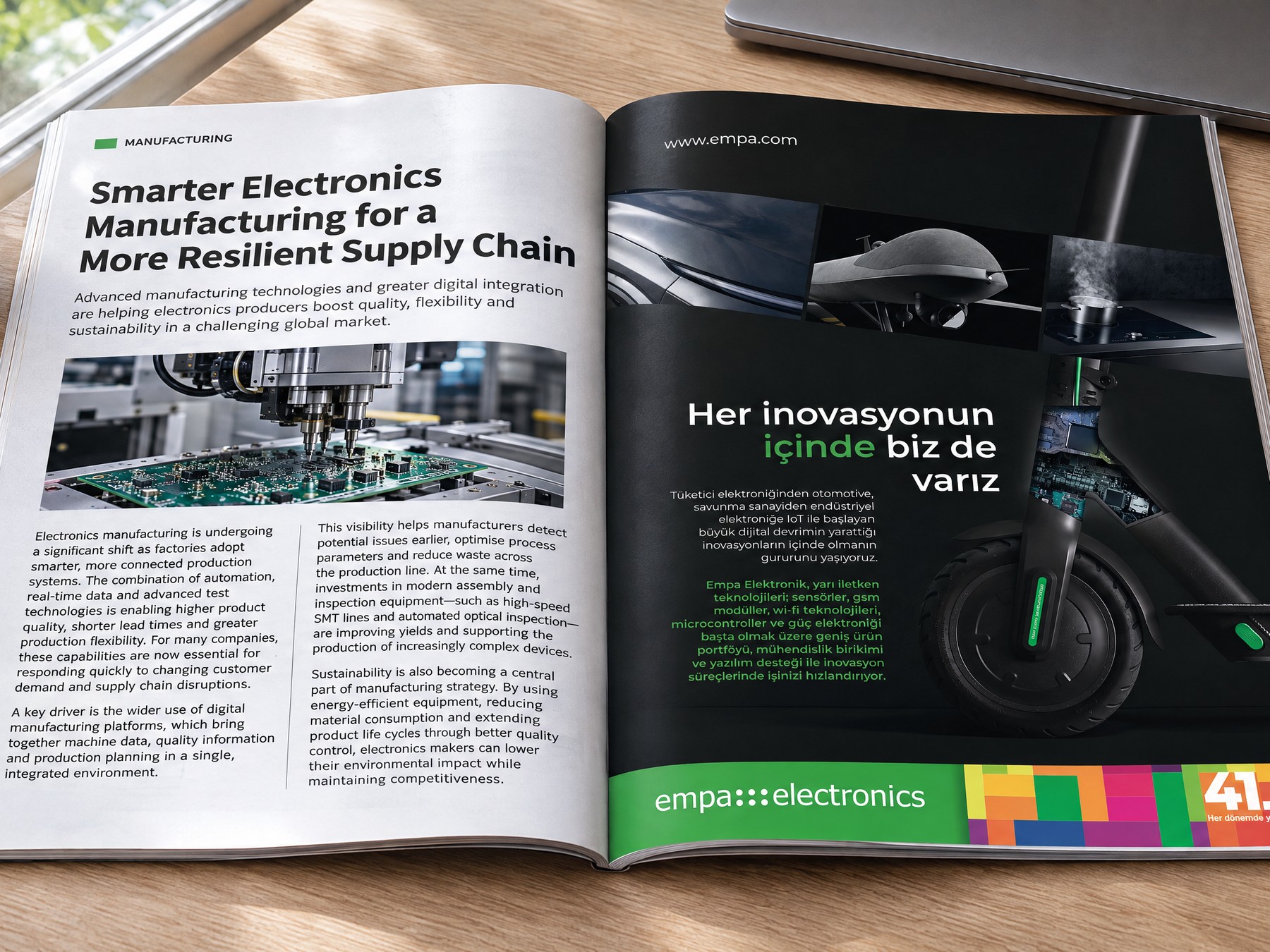
Empa.
We renewed the logo and corporate identity of Empa, Türkiye's long-established technology supplier, without breaking with its past.
We carried a long-established brand into its new era.
Empa's logo dates back to the 1990s: a signature that customers, manufacturers and the industry have recognized for years.
Today, alongside component supply, Empa develops engineering solutions in embedded systems, edge AI and IoT at its own R&D centre. With Tiremo, the product of that expertise, it also offers a technology platform of its own, giving customers ready-made hardware and software building blocks and shortening their product development cycles.
The brand of a company on this scale has to speak to investors, engineers, customers and international partners at the same time. The difficulty was doing so without losing nearly thirty years of recognition.
We chose continuity over a break. We designed a brand identity that those who know Empa recognize at first glance, and in which those meeting it for the first time see a contemporary technology company.
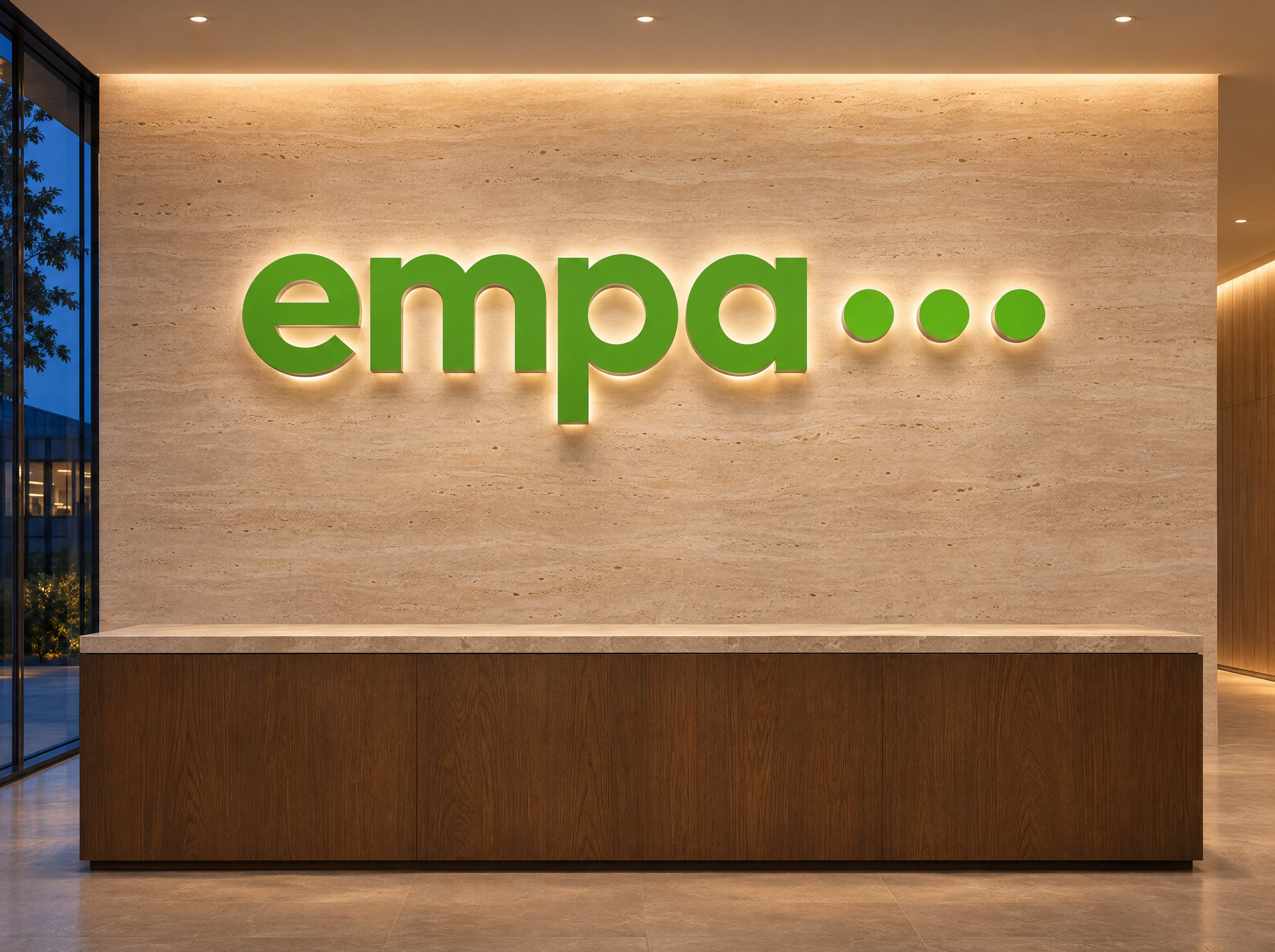
We renewed the logo and kept it recognizable.
We designed the new logo as a continuation of the old one. The name and the colour, which carry the recognition, stayed in place. Everything that changed moved towards simplicity.
Today Empa offers not only electronic components but technology and solutions, so the logo no longer ties the company to a single line of business. The simplified mark works with the same clarity at every scale, from a browser tab to a building façade.
What We Did.
- 01Logo Design
We renewed a logo that had been in use for nearly thirty years and kept it recognizable. We simplified the mark and made the logo able to carry the whole of the company's business today.
- 02Corporate Identity
From business cards to the building façade, from presentations to digital uses, we tied every surface where the brand appears into a single system and gathered that system in a comprehensive identity guide.
- 03Sub-brand
We designed a separate brand identity for Tiremo, Empa's technology platform, and positioned it under the Empa umbrella. We set up a shared naming system for the platform's products.
- 04Communication
We rethought the opening communication of the website and created key visuals for the site's opening and for the launch of the new identity.
We tied the identity into a system that gives the same result everywhere.
In a company with offices in five cities that takes part in events at home and abroad, the brand is reproduced by different hands every day: at an event, in a presentation, in a proposal document. Keeping the identity consistent depends not on individual designs but on a system that everyone can apply.
We kept Empa green and added anthracite beside it. The same two colours carry Tiremo's identity as well and tie the two brands into one family.
From business cards to letterheads, from flags to building signage, from the presentation template to digital uses, we defined every application in a single identity guide. The guide ensures that Empa appears with the same coherence in all its offices and on every communication surface, from Istanbul to New York.
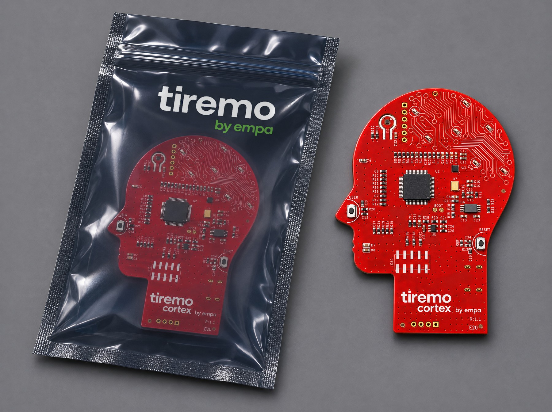
We gave Tiremo an identity of its own.
Tiremo is the edge AI and IoT platform that Empa develops at its R&D centre. The company's own technology needed a position that neither left it in the shadow of the parent brand nor cut it off from it.
We designed a separate brand identity for the platform. Tiremo stands out under its own name and, in Empa's green and anthracite, reads as part of the same family. The "by empa" signature beneath it points to the company behind it.
We tied the platform's products into a shared naming system: tiremo.cortex, tiremo.AIoT, tiremo.vision. Every new product that joins the family is named by the same rule and needs no logo of its own.
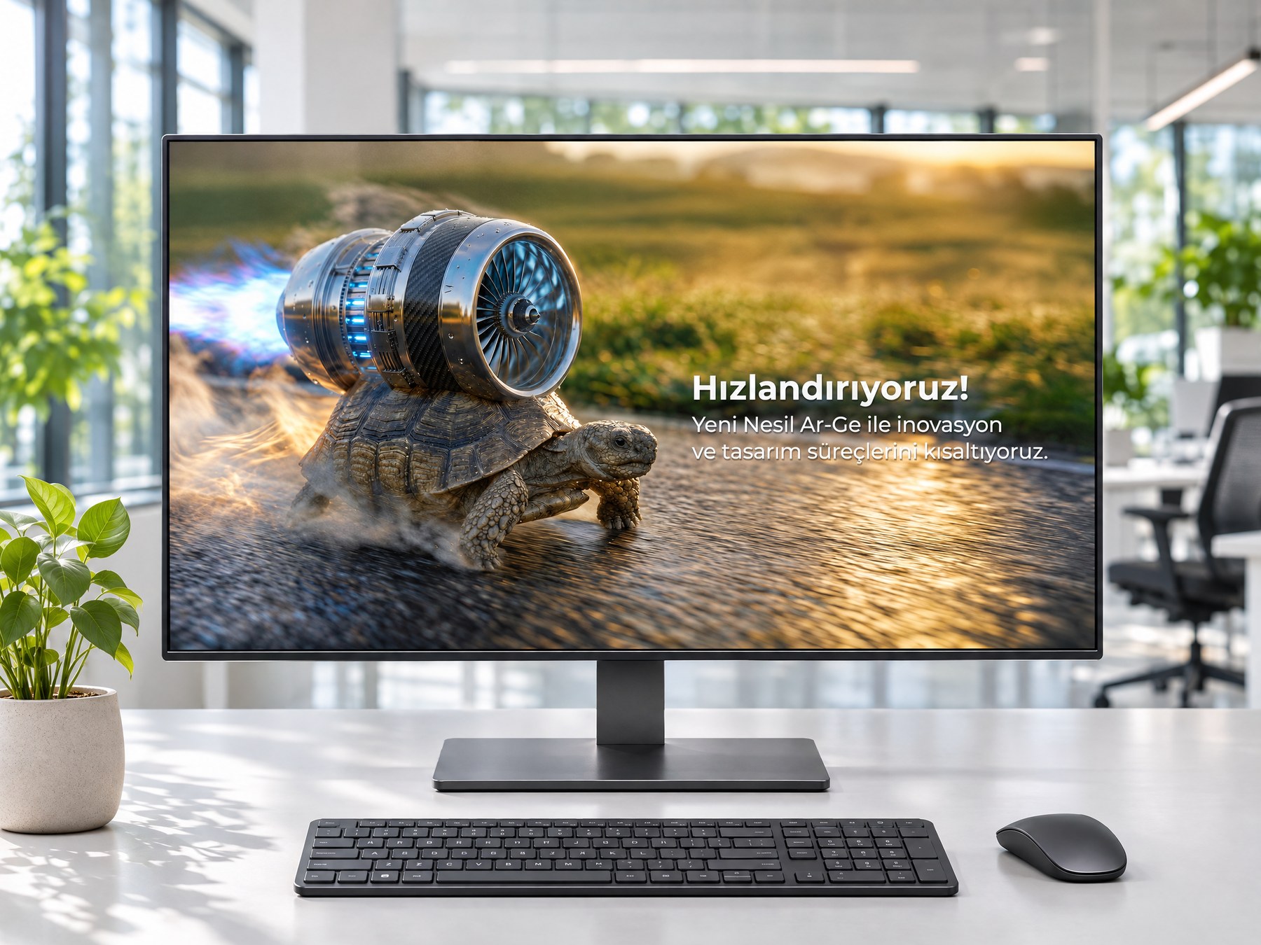
We rethought the digital communication.
Empa's website is the first point of contact for the engineer or purchasing manager meeting the company for the first time. We turned the site's opening area into communication that puts what Empa brings to its customers ahead of the product catalogue.
Empa's promises to its customers are clear: the supply of technology and solutions, not just products; shorter innovation and design cycles through next-generation R&D; engineering support from idea to prototype; and exploring the latest technologies together in hands-on workshops. We produced a key visual for each of these promises. Each one, together with its message, was carried from the website to social media and video, across the whole of Empa's digital communication.
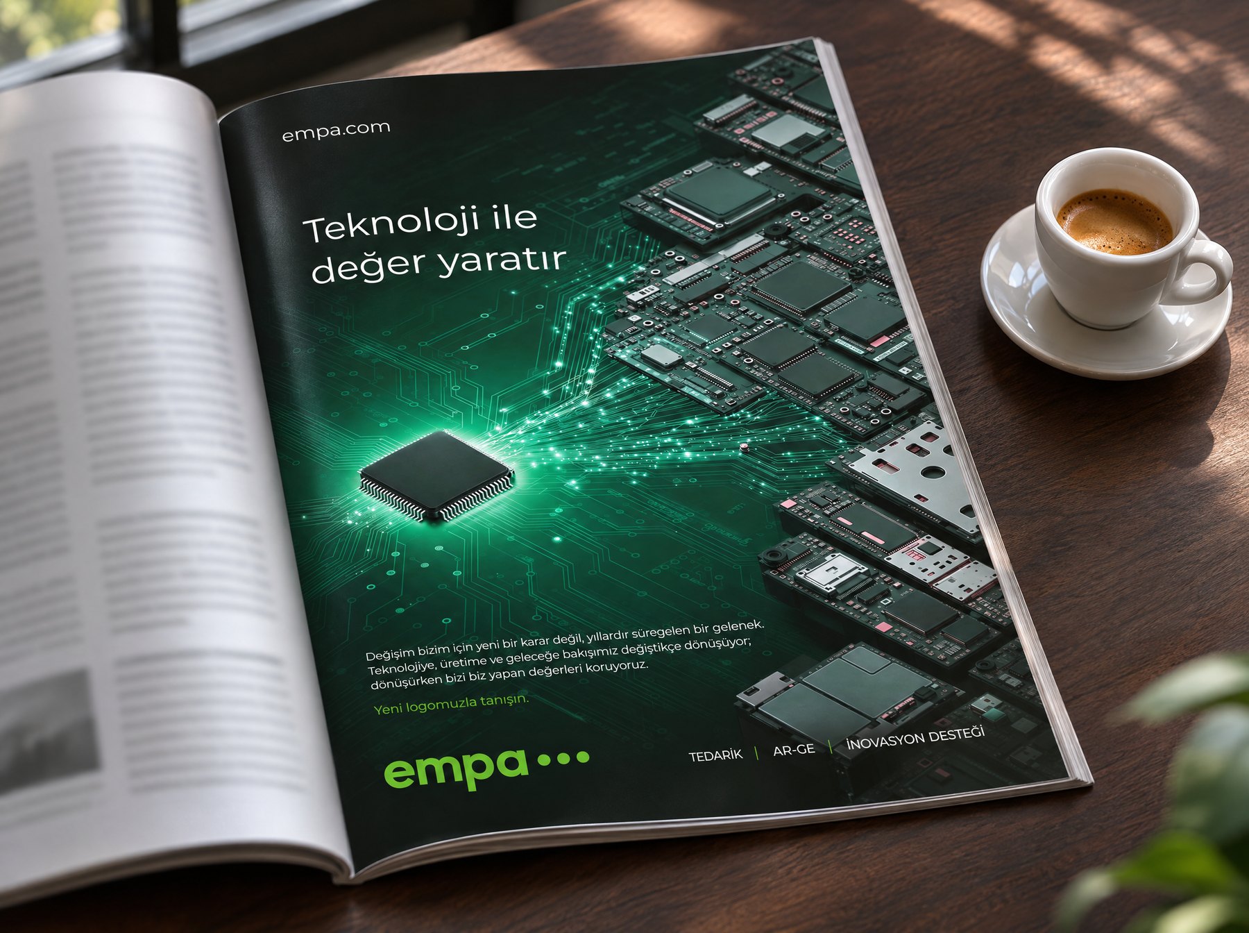
We announced the new identity in Empa's own words.
A logo change is a sensitive moment for a long-established company. Told the wrong way, it reads like giving up on the past.
We built the launch communication of the new identity on a key visual that presents the renewal as a continuation of the company's character. The message presents change as an Empa tradition: "For us, change is not a new decision but a tradition that has been going on for years."
Empa gained its new identity in the year it went public.
For Empa, 2026 was the year of both the public offering and the new identity. From investors to engineers, from customers to business partners, everyone who encounters Empa now sees the same brand: simple, self-assured and at home in technology.
From component supply to R&D, from Tiremo to the offices abroad, all of the company's activities stand under the same name and the same system. We built the identity to carry Empa's future growth as well.
Images