TEKCE.
We designed the UX and UI of the website of TEKCE, an international real-estate company with offices in five countries.
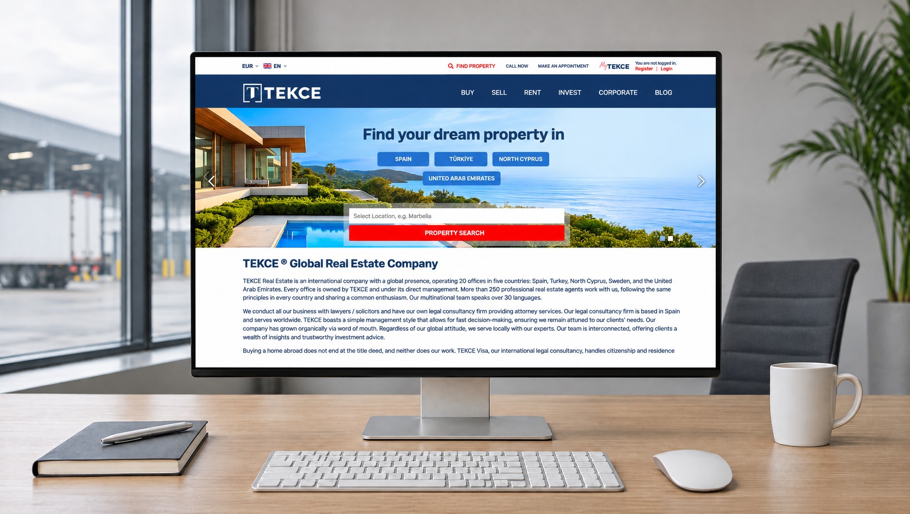
One front door for everyone looking for a home in four countries.
Visitors come to TEKCE from everywhere and for every reason: an investor looking at Dubai, a retiree looking for a home in Antalya, someone buying in Spain for a residence permit. In front of them are four countries and thousands of listings. We designed the site to make that crowd simple at first glance.
Everything starts with one question: where? The visitor picks the country, types the place they have in mind and is already among the listings. There is no menu to learn and no pages to wander through. Search, filtering and the listing page follow the same plain logic: first the home, then what is needed to decide, and at the end a viewing request in a single step. Navy carries trust, red carries the one action. Whatever language the page opens in, it speaks with the same clarity.
What We Did.
- 01UX (Experience) Design
Buyers, sellers, tenants and investors arrive with different questions. Each finds their own way on the first screen and reaches the home they want in a few taps, without learning the menu.
- 02Search and Listings
Searching thousands of listings without getting lost: the visitor types the place, narrows the results, compares. Price, payment plan and completion date are visible in the list itself. The decision matures before a listing is even opened.
- 03UI (Interface) Design
Navy carries trust, red carries action. The same calm, readable look in four countries and twelve languages. Wherever a visitor enters, they meet the same site.
- 04Mobile Design
The phone version is not a shrunken desktop but a separate interface built on its own rules. Search starts on a single line, a listing is read with one hand, an adviser is one tap away.
- 05Account and Network
Buyers save the listings they like. Sellers and partners run their business from their own area. Wherever in the world they are, the nearest office, their own language and their own currency are a click away.
- 06Local Brands
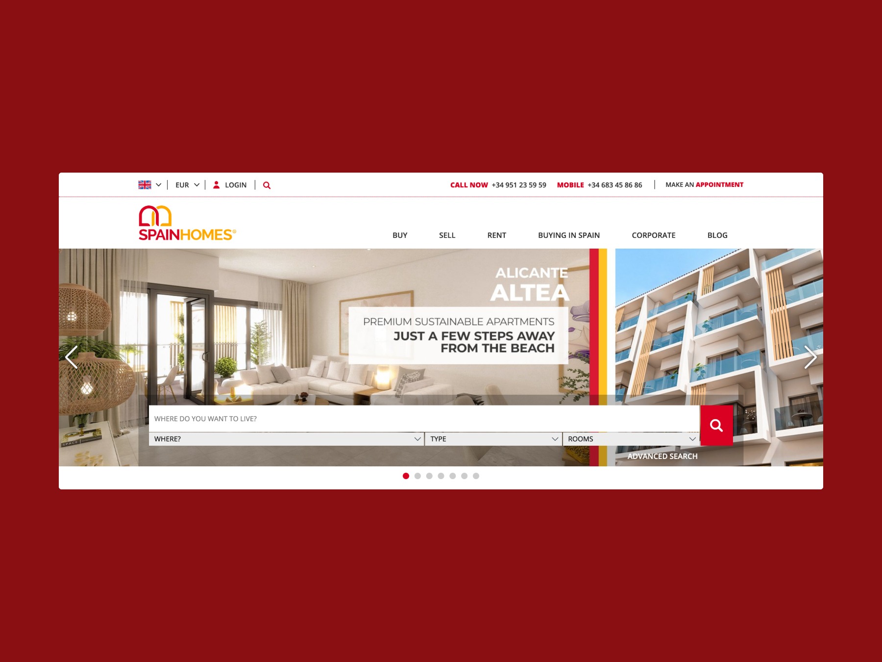
One design language, the whole family: Spain Homes, Antalya Homes, Istanbul Homes, Bursa Homes, Trabzon Homes and Immobilier Turquie carry the same trust with their own identity.
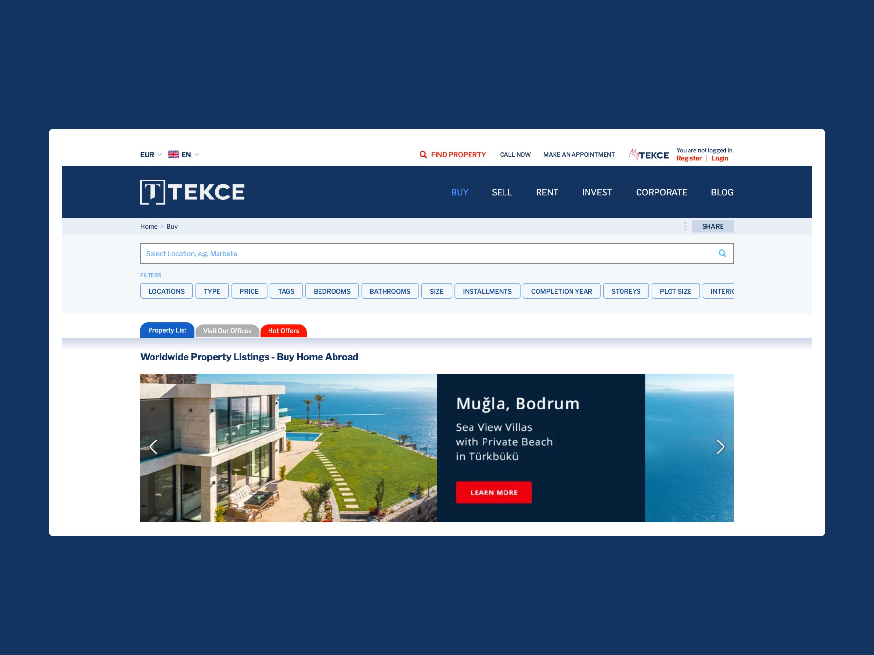
Thousands of listings, a list that filters at a glance.
The listings page is the most used page of the site. We made it the least tiring one. The buyer narrows budget, region and property type in a few taps, and sees price, payment terms and completion date without opening a card.
The list gets shorter not as it grows but as the buyer decides. By the time the right home appears on screen, the rest has already been ruled out.
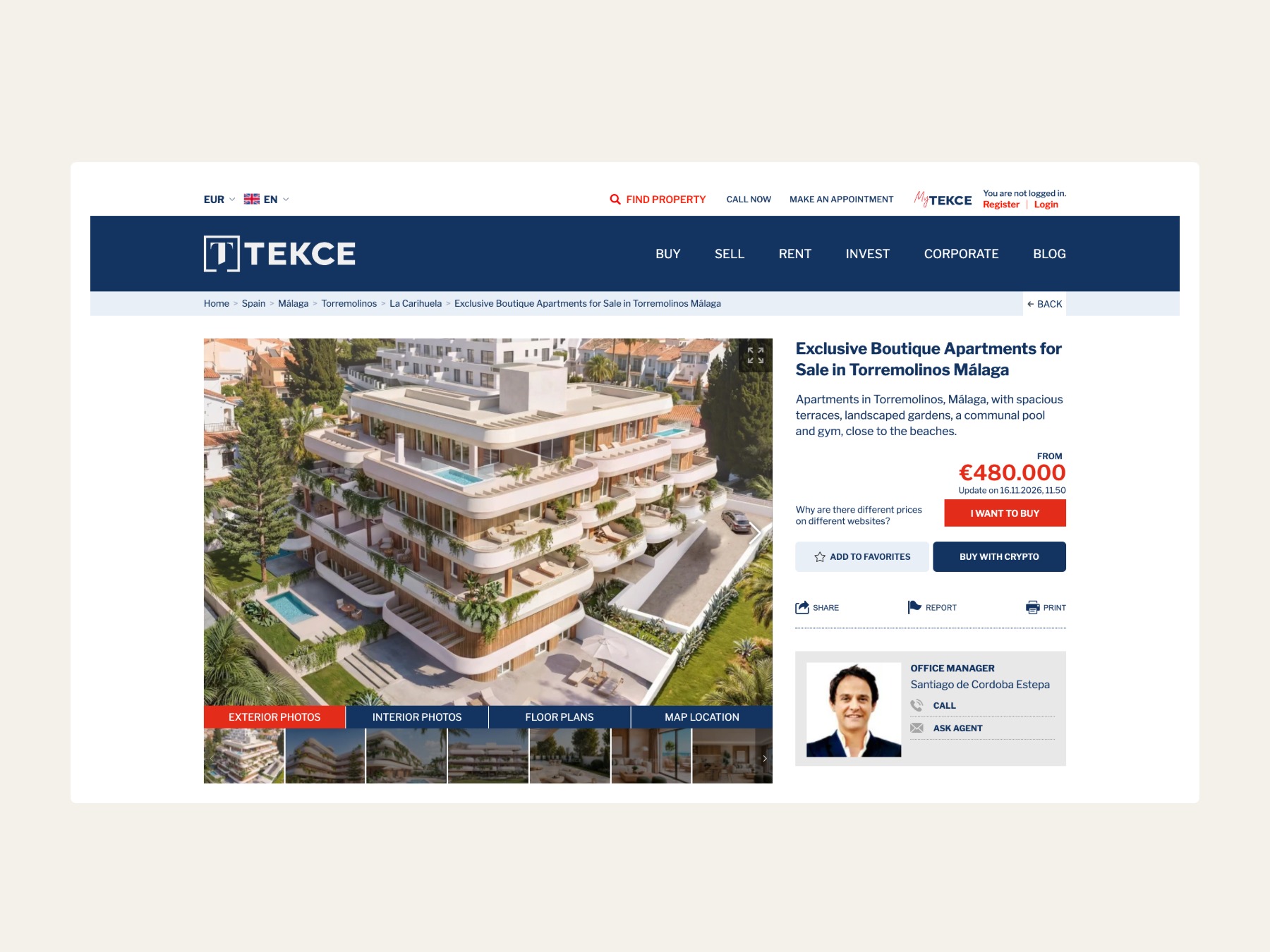
A listing page that takes the buyer to a viewing in one step.
A buyer opens a listing to see the home and to decide. The page shows the home first, then gives what the decision needs: price, payment options, purchase costs, the office manager.
Viewing and information request are on the same page. When buyers find what they are looking for, they request a viewing without leaving the site.
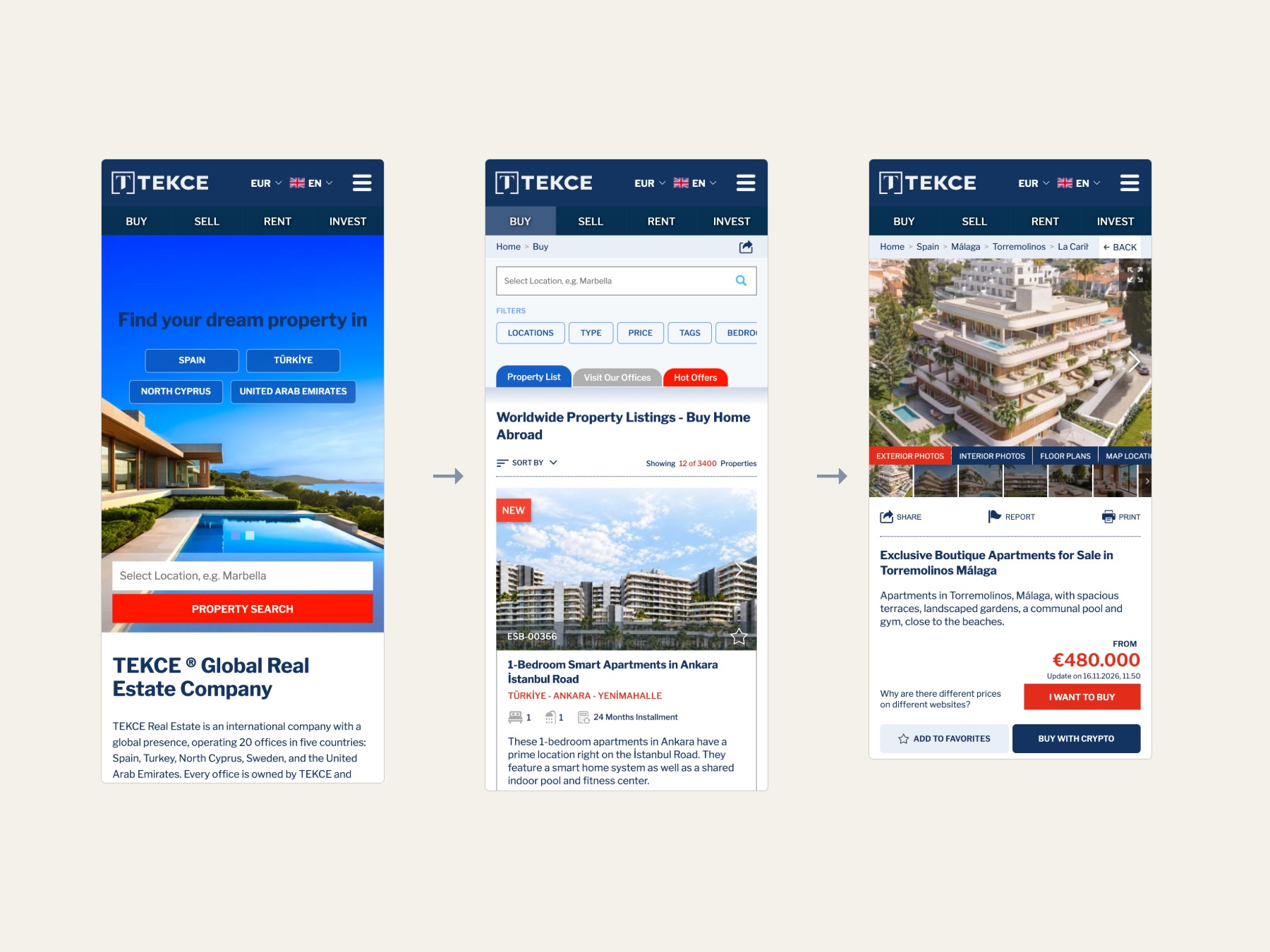
A separate site on the phone.
The phone version is not a shrunken desktop but a separate site built on its own rules. Country, search, listing: three taps. Filters sit under the thumb, the adviser is one tap away.
One design language, every brand.
The UX and UI language built for tekce.com was carried to TEKCE's local brands and campaign landing pages. Spain Homes, Antalya Homes, Istanbul Homes, Bursa Homes, Trabzon Homes and Immobilier Turquie keep the same search, the same listing card and the same trust in their own colours.
The design keeps working as TEKCE's digital backbone. New countries, new languages and new services join the same system.
Images